Plasma Widget Tutorial
This tutorial has been upstreamed to the KDE Documentation with improvements like using the newer PlasmaComponents 3.0 and QtQuick.Controls 2.0 in your widget. This older tutorial still uses PlasmaComponents 2.0 and QtQuick.Controls 1.0. This tutorial is out of date.
Default Widgets
🖉Learn By Example
You can learn by example by reading the default widgets located at:
/usr/share/plasma/plasmoids/
You can fork an existing widget by copying the widget to where the downloaded widgets are installed to:
~/.local/share/plasma/plasmoids/
To properly fork the widget, rename the new folder, then edit the X-KDE-PluginInfo-Name in the metadata.desktop file to match the new folder name. You will also want to edit the Name= in the metadata.desktop file as well so you can tell it apart from the widget you forked it from. You should delete all the translated Name[fr]= lines as well. Delete the metadata.json if it exists (or edit it as well).
Finally, run plasmawindowed to quickly test the newly forked widget.
cd /usr/share/plasma/plasmoids/
mkdir -p ~/.local/share/plasma/plasmoids
cp -r /usr/share/plasma/plasmoids/org.kde.plasma.analogclock/ ~/.local/share/plasma/plasmoids/
cd ~/.local/share/plasma/plasmoids/
mv ./org.kde.plasma.analogclock ./com.github.zren.myanalogclock
cd ./com.github.zren.myanalogclock
kwriteconfig5 --file="$PWD/metadata.desktop" --group="Desktop Entry" --key="X-KDE-PluginInfo-Name" "com.github.zren.myanalogclock"
kwriteconfig5 --file="$PWD/metadata.desktop" --group="Desktop Entry" --key="Name" "My Analog Clock"
sed -i '/^Name\[/ d' ./metadata.desktop
sed -i '/^Comment\[/ d' ./metadata.desktop
rm ./metadata.json
plasmawindowed com.github.zren.myanalogclock
Setup
🖉Folder Structure
To start a new widget from scratch, first create a folder for your new widget somewhere in you coding directory (eg: ~/Code/plasmoid-helloworld).
Inside it create another folder called package. Everything inside the package folder will be what we eventually install to ~/.local/share/plasma/plasmoids/com.github.zren.helloworld/. Eventually we will zip the contents of package and share them online. We can keep text editor files, build scripts, screenshots, etc outside the package directory.
Inside the package folder will be a metadata.desktop file which is basically a Linux .ini file. This file will describe the name of the widget, the category it’s in, and various other plasma specific keys like the main QML file.
Inside contents, we will create the ui and config folders. ui is the folder which should contain your layout files like the main.qml and the configGeneral.qml. configGeneral.qml is the layout of the first tab in the widget’s configuration window.
Inside the config folder we have the main.xml which contains the schema of all our serialized configuration keys+values. The config.qml is used to define the tabs in the configuration window. Each tab will open a QML layout file (like ui/configGeneral.qml).
Note that you don’t need the 3 config files. You can get away with just the main.qml and metadata.desktop for a barebones widget.
~/Code/plasmoid-helloworld/package/contents/config/config.qmlmain.xml
ui/configGeneral.qmlmain.qml
metadata.desktop
metadata.desktop
Inside the metadata.desktop file we need to set the Name of the widget. The Type should be Service since the .desktop file is not an app launcher and we don’t want this to appear in the app menu.
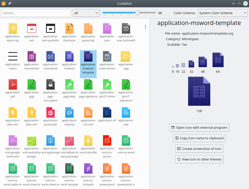
Icon is the icon name associated with the widget. You can search for icon names in the /usr/share/icon folder. You can also look for an icon name by right clicking your app launcher widget then editing the icon in it’s settings. It uses a searchable interface and lists them by category. Plasma’s SDK also has the Cuttlefish app (screenshot) which you can install with sudo apt install plasma-sdk.
X-KDE-PluginInfo-Name needs to be a unique name, since it’s used for the folder name it’s installed into. You could use com.github.zren.helloworld if you’re on github, or use org.kde.plasma.helloworld if you’re planning on contributing the widget to KDE.
Widgets installed by the user (without root) like when you “Install New Widgets” will be installed to ~/.local/share/plasma/plasmoids/ (which may not yet exist). The default widgets shipped with KDE are installed to /usr/share/plasma/plasmoids/.
X-KDE-PluginInfo-Category is the category the widget can be filtered with in the widget list. A list of category names can be found here.
X-KDE-ServiceTypes, X-Plasma-API, and X-Plasma-MainScript are also needed to just define that this package is a plasma widget, and where it’s entry point is.
For more, read the Getting Started tutorial on the KDE wiki.
[Desktop Entry]
Name=Hello World
Comment=A widget to take over the world!

Type=Service
Icon=battery
X-KDE-ServiceTypes=Plasma/Applet

X-Plasma-API=declarativeappletscript
X-Plasma-MainScript=ui/main.qml

X-KDE-PluginInfo-Author=My Name
X-KDE-PluginInfo-Email=myemail@gmail.com
X-KDE-PluginInfo-Name=com.github.zren.helloworld
X-KDE-PluginInfo-Version=1
X-KDE-PluginInfo-Website=https://github.com/Zren/plasmoid-helloworld
X-KDE-PluginInfo-Category=System Information
contents/ui/main.qml
This is the entry point. Various properties are available to be set. You should know that widgets have several ways of being represented.
- You can have a widget in the panel, which is just an icon that will show a popup window when clicked.
- You can also have it on the desktop as a desktop widget which can be resized by the user. As a desktop widget it can switch between the “icon view” when smaller (which opens a popup), and directly showing the contents of the popup on the desktop when there’s enough room.
- You can also have the widget inside another widget (a containment) like the system tray or the panel itself.
- The widget can also be run like an application in it’s own window (Calculator).
plasmoid.location and plasmoid.formFactor can tell you how the widget is placed. plasmoid is a global variable which is defined when you import org.kde.plasma.plasmoid 2.0. Read more below.
Plasmoid.compactRepresentation (with a capital) and Plasmoid.fullRepresentation are used to define the layout of the small “icon” view and the full “popup” view. These are both properties of the main Item. If neither are set, by default the main Item is the full representation.
If you change the compact representation, you will need to use a MouseArea to toggle the plasmoid.expanded property. See the DefaultCompactRepresentation.qml for an example.
Layout.preferredWidth can be used to define the default width of a panel widget, or the size of the popup window (unless it is in the system tray). The system tray has a fixed hardcoded size for it’s popups. Layout.preferredWidth can also define the width of the compact “icon” view in the horizontal panel, not just the full “popup” width. Note that the Layout.preferredWidth/Layout.preferredHeight of the Plasmoid.compactRepresentation will automatically scale to the thickness of the panel depending on if it’s a vertical or horizontal panel.
Layout.minimumWidth can be used to define the minimum size for a desktop widget / popup.
width/height (not Layout.__) can be used to define the default size of a desktop widget. Desktop widgets currently ignore Layout.preferredWidth when calculating the default size.
You can set the tooltip contents and various other things in the main.qml.
Examples of main.qml
- Various examples in the Getting Started tutorial on the KDE wiki.
- colorpicker/package/contents/ui/main.qml
- fifteenPuzzle/package/contents/ui/main.qml
// main.qml
import QtQuick 2.0
import org.kde.plasma.components 2.0 as PlasmaComponents

PlasmaComponents.Label {
    text: "Hello World!"
}
To show the text in the panel rather than in a popup:
// main.qml
import QtQuick 2.0
import org.kde.plasma.components 2.0 as PlasmaComponents
import org.kde.plasma.plasmoid 2.0

PlasmaComponents.Label {
    text: "Hello World!"

    // Always display the full view. Never show the compact icon view
    // like it does by default when shown in the panel.
    Plasmoid.preferredRepresentation: Plasmoid.fullRepresentation
}
To set the popup size:
// main.qml
import QtQuick 2.0
import QtQuick.Layouts 1.0
import org.kde.plasma.components 2.0 as PlasmaComponents
import org.kde.plasma.plasmoid 2.0

Item {
    // Always display the compact view.
    // Never show the full popup view even if there is space for it.
    Plasmoid.preferredRepresentation: Plasmoid.compactRepresentation

    Plasmoid.fullRepresentation: Item {
        Layout.minimumWidth: label.implicitWidth
        Layout.minimumHeight: label.implicitHeight
        Layout.preferredWidth: 640 * units.devicePixelRatio
        Layout.preferredHeight: 480 * units.devicePixelRatio

        PlasmaComponents.Label {
            id: label
            anchors.fill: parent
            text: "Hello World!"
            horizontalAlignment: Text.AlignHCenter
        }
    }
}
Testing
🖉plasmawindowed
There are 3 ways to test a widget.
plasmawindowedcan be used if the widget is installed to:
~/.local/share/plasma/plasmoids
It will remember any changes you make to the config as this is the same command used for “Windowed widgets” like the “Calculator” app. It has limited features for displaying the widget, but the command should be preinstalled.plasmoidviewer, explained further down, can display a widget as a desktop widget, or a panel widget. You can also test a widget that is not yet installed. You will need to first install theplasma-sdkpackage to use it.- Install the widget and add it to your panel. Restarting plasma every time using:
plasmashell --replace
I only recommend this testing method for a final test as it takes a few seconds for the panel to load.
plasmawindowed --helpUsage: plasmawindowed [options] applet [args...]
Plasma Windowed
Options:
--statusnotifier Makes the plasmoid stay alive in the Notification Area,
even when the window is closed.
-v, --version Displays version information.
-h, --help Displays this help.
Arguments:
applet The applet to open.
args Arguments to pass to the plasmoid.plasmoidviewer
With metadata.desktop and main.qml, we now have enough to test our widget. If you haven’t yet, install the plasma-sdk package with sudo apt install plasma-sdk.
plasmoidviewer --helpUsage: plasmoidviewer [options]
Run Plasma widgets in their own window
Options:
-v, --version Displays version information.
-c, --containment <containment> The name of the containment plugin
-a, --applet <applet> The name of the applet plugin
-f, --formfactor <formfactor> The formfactor to use (horizontal, vertical,
mediacenter, planar or application)
-l, --location <location> The location constraint to start the
Containment with (floating, desktop,
fullscreen, topedge, bottomedge, leftedge,
rightedge)
-x, --xPosition <xPosition> Set the x position of the plasmoidviewer on
the plasma desktop
-y, --yPosition <yPosition> Set the y position of the plasmoidviewer on
the plasma desktop
-s, --size <widthXheight> Set the window size of the plasmoidview
-p, --pixmapcache <size> The size in kB to set the pixmap cache to
-t, --theme <themeName> The name of the theme which the shell will
use
-h, --help Displays this help.Test as Desktop Widget
Note that --location=desktop is used for the desktop wallpaper, not desktop widgets. Desktop widgets use --location=floating.
plasmoidviewer -a package --location=floating --formfactor=planar
plasmoidviewer -a package -l=floating -f=planar
plasmoidviewer -a package # floating+planar is the default.
Test as Horizontal Panel Widget
If we set plasmoidviewer’s plasmoid.formFactor to be horizontal and plasmoid.location to the topedge or bottomedge, we can test a widget focusing in the panel.
plasmoidviewer -a package -l topedge -f horizontalTesting DPI Scaling
By setting the QT_SCALE_FACTOR=2 we can double the DPI value from 96 to 192 just for the plasmoidviewer window. This is great for testing if your code will support a HiDPI screen.
If you’re testing a very high DPI, you’ll probably find the default plasmoidviewer window is too small to show the widget, so we’ll set the size and position of the window. Note that the window will go maximized if you set a size larger than you screen has available.
QT_SCALE_FACTOR=2 plasmoidviewer -a package
QT_SCALE_FACTOR=2 plasmoidviewer -a package -l topedge -f horizontal -x 0 -y 0 -s 1920x1080
Enable logging
By default in Qt 5.9, console.log(), which used to write a string to stdout (the Terminal output), is hidden by default. In order to reenable it, we need to set [Rules] qml.debug=true in ~/.config/QtProject/qtlogging.ini. You can easily set it by running this kwriteconfig5 command:
kwriteconfig5 --file ~/.config/QtProject/qtlogging.ini --group "Rules" --key "qml.debug" "true"// main.qml
Item {
Component.onCompleted: {
console.log("Hello World")
}
}# ~/.config/QtProject/qtlogging.ini
[Rules]
qml.debug=trueQml
🖉Quick Intro
This is a quick intro to QML. If you’re comfortable with it, skip to the next section.
The official QML tutorial can be found in the QML Documentation.
Item
An Item is a simple object. It can have children as well. Item’s have a default width and height of 0px, and will not grow to fit their contents. So unlike the HTML box model, you’ll need to use layouts mentioned below.
// main.qml
import QtQuick 2.0

Item {
    id: widget

    Item {
        id: childItemA
    }

    Item {
        id: childItemB
    }
}
Rectangle
If we want to draw a colored rectangle, we can easily do so with Rectangle. For other properties of the Rectangle, like border color and width, read it’s page in the QML Documentation.
// main.qml
import QtQuick 2.0

Rectangle {
    color: "#0ff" // Teal
}
Items are 0px wide by default
By default, an Item will not expand to fit it’s contents. Nor will it expand to fit the width of it’s parent (like a <div> in HTML).
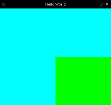
In the this example, only the Teal Rectangle will be visible, since the Green Rectangle has the default width of 0px and height of 0px. The Teal Rectangle is only visible since the root item in a widget’s main.qml has a default size which will be explained later.
// main.qml
import QtQuick 2.0

Rectangle { // Unlike everything else, the widget's main item will have a default size.
    color: "#0ff" // Teal

    Rectangle { // For everything else, we need to set the size.
        color: "#0f0" // Green
    }
}
anchors.fill
In this second example, we make the Green Rectangle resize to the parent item, the Teal Rectangle. This will completely cover the Teal Rectangle so only the Green Rectangle will be visible.

// main.qml
import QtQuick 2.0

Rectangle { // Unlike everything else, the widget's main item will have a default size.
    color: "#0ff" // Teal

    Rectangle { // For everything else, we need to set the size.
        color: "#0f0" // Green
        anchors.fill: parent // Make sure we're the same size as the parent.
    }
}
anchors.bottom
In this third example, we anchor the Green Rectangle to the bottom right, and make it half the width & height of the Teal rectangle. So we end up with a rectangle which is 3/4 teal and 1/4 green.
Other ways to use anchors properties can be read in the QML Documentation page on Positioning with Anchors and the Item.anchors property group.
// main.qml
import QtQuick 2.0

Rectangle {
    color: "#0ff" // Teal

    Rectangle {
        color: "#0f0" // Green
        anchors.right: parent.right
        anchors.bottom: parent.bottom
        width: parent.width / 2
        height: parent.height / 2
    }
}
ColumnLayout
If you want to stack a number of items on top of each other, you should use a ColumnLayout.
Labels (which are just fancy Text items which follow Plasma’s colors) have a default font size, which means they have their own default height. So they will be stacked on top of each other.
Note that if the ColumnLayout is taller than it’s contents, the children will have spacing between them.

// main.qml
import QtQuick 2.0
import QtQuick.Layouts 1.0
import org.kde.plasma.components 2.0 as PlasmaComponents

ColumnLayout {
    PlasmaComponents.Label {
        text: "Item 1"
    }
    PlasmaComponents.Label {
        text: "Item 2"
    }
}
Layout.fillWidth: true
If you want an item to scale to the parent’s width, you have the option of setting it to be the same width as the parent (which doesn’t work in a Layout). You can also try anchoring to the left and right (which does work).
Within a Layout however, the proper way to do so is to use the special property attached to the contents of a Layout, Layout.fillWidth. Setting it to true will make the item scale to fill up the empty space.

The other Layout related properties can be read here.
// main.qml
import QtQuick 2.0
import QtQuick.Layouts 1.0

ColumnLayout {
    Rectangle {
        color: "#f00" // Red
        height: 40
        Layout.fillWidth: true
    }
    Rectangle {
        color: "#0f0" // Green
        height: 40
        width: parent.width // Does not work
    }
    Rectangle {
        color: "#00f" // Blue
        height: 40
        width: 40 // Does not fill parent
    }
    Rectangle {
        color: "#ff0" // Yellow
        height: 40
        anchors.left: parent.left
        anchors.right: parent.right
        // anchors in a ColumnLayout throws a "undefined behavior" warning.
    }
}
Layout.fillHeight: true
If you want one item (or several) in a Layout to expand to take up the unused space, you can use Layout.fillHeight: true.

// main.qml
import QtQuick 2.0
import QtQuick.Layouts 1.0

ColumnLayout {
    Rectangle {
        color: "#f00" // Red
        height: 40
        Layout.fillWidth: true
    }
    Rectangle {
        color: "#0f0" // Green
        Layout.fillHeight: true
        Layout.fillWidth: true
    }
    Rectangle {
        color: "#00f" // Blue
        Layout.fillHeight: true
        Layout.fillWidth: true
    }
    Rectangle {
        color: "#ff0" // Yellow
        height: 40
        Layout.fillWidth: true
    }
}
Spacing between items in a Layout
In the last screenshot you might have noticed how there is still spacing between the items. That’s because the default ColumnLayout.spacing property is set to 5. Assigning it to 0 will remove the extra whitespace.

// main.qml
import QtQuick 2.0
import QtQuick.Layouts 1.0

ColumnLayout {
    spacing: 0

    Rectangle {
        color: "#f00" // Red
        height: 40
        Layout.fillWidth: true
    }
    Rectangle {
        color: "#0f0" // Green
        Layout.fillHeight: true
        Layout.fillWidth: true
    }
    Rectangle {
        color: "#00f" // Blue
        Layout.fillHeight: true
        Layout.fillWidth: true
    }
    Rectangle {
        color: "#ff0" // Yellow
        height: 40
        Layout.fillWidth: true
    }
}
Other Layouts
There’s also RowLayout and GridLayout. Lastly there’s Flow which will treat it’s contents as if they all had the CSS display: inline-block.

// main.qml
import QtQuick 2.0
import QtQuick.Layouts 1.0
import org.kde.plasma.components 2.0 as PlasmaComponents

RowLayout {
    PlasmaComponents.Label {
        text: "Item 1"
    }
    PlasmaComponents.Label {
        text: "Item 2"
    }
}
Plasma's QML API
🖉Intro
KDE Frameworks ships with a number of useful extensions to Qt’s QML. The API documentation is a good start if you need to know what a specific property does. If you want to browse any of the sources easier, it’s also mirrored on GitHub.
PlasmaComponents.Label
QML ships with a Text type, but Plasma extends it with Label.qml which assigns a number of defaults. One thing is it sets the text color to follow the panel’s color scheme. For the specifics, you can read the Label.qml source code.
// main.qml
import QtQuick 2.0
import org.kde.plasma.components 2.0 as PlasmaComponents

PlasmaComponents.Label {
    text: i18n("Hello World")
}
Heading, Paragraph
To be consistent with elsewhere in Plasma, Plasma ships with a couple different Label/Text types with preset default sizes. You will need to import PlasmaExtras to use them.
Heading.qml
Various Font Size levels, Wraps withLayout.fillWidth: trueParagraph.qml
Justified Alignment, Wraps withLayout.fillWidth: true
// main.qml
import QtQuick 2.0
import QtQuick.Layouts 1.0
import org.kde.plasma.extras 2.0 as PlasmaExtras

ColumnLayout {
    spacing: 0

    Repeater {
        model: 5
        PlasmaExtras.Heading {
            Layout.fillWidth: true
            level: index + 1
            text: i18n("Header level %1", level)
        }
    }

    PlasmaExtras.Paragraph {
        Layout.fillWidth: true
        text: i18n("Lorem ipsum dolor sit amet, consectetur adipiscing elit. Aenean sit amet turpis eros, in luctus lectus. Curabitur pulvinar ligula at leo pellentesque non faucibus mauris elementum. Pellentesque convallis porttitor sodales. Maecenas risus erat, viverra blandit vestibulum eu, suscipit in est. Praesent quis mattis eros. Sed ante ante, adipiscing non gravida sed, ultrices ultrices urna. Etiam congue mattis convallis. Maecenas sollicitudin mauris at lorem aliquam in venenatis erat convallis. Fusce eleifend scelerisque porttitor. Praesent metus sapien, hendrerit ac congue eget, feugiat id enim. Morbi venenatis gravida felis, vitae varius nunc dictum a. Etiam accumsan, velit ac tempor convallis, leo nibh consequat purus, sit amet fringilla nisi mi et libero.")
    }
}
PlasmaComponents Controls
QML ships with various controls, like CheckBox, RadioButton, ComboBox (DropDown Menu), SpinBox, Slider, TextField, TextArea, Button, ToolButton. Plasma extends these controls to style them using the SVGs from the Plasma Theme. It also assigns a number of default settings like setting the text color to follow the panel’s color scheme. For Plasma’s specific changes, you can read the QML source code for each control in:
plasma-framework/src/declarativeimports/plasmacomponents/qml/
CheckBox - Toggle
For a simple toggle, QML ships with CheckBox. For Plasma’s specific changes, you can read the QML source code at:
// main.qml
import QtQuick 2.0
import org.kde.plasma.components 2.0 as PlasmaComponents

PlasmaComponents.CheckBox {
    text: i18n("Hello World")
    checked: true
}SpinBox, Slider - Numbers
To control Integer or Real numbers, QML ships with SpinBox and Slider. For Plasma’s specific changes, you can read the QML source code for each:
SpinBox.qml(not skinned)Slider.qml
// main.qml
import QtQuick 2.0
import QtQuick.Controls 1.0
import QtQuick.Layouts 1.0
import org.kde.plasma.components 2.0 as PlasmaComponents

RowLayout {
    PlasmaComponents.Label {
        text: i18n("Label:")
        Layout.alignment: Qt.AlignRight
    }
    SpinBox {
        minimumValue: 0
        maximumValue: 100
        value: 25
        stepSize: 1
    }
}
// main.qml
import QtQuick 2.4
import QtQuick.Layouts 1.0
import org.kde.plasma.components 2.0 as PlasmaComponents
RowLayout {
PlasmaComponents.Slider {
id: slider
Layout.fillWidth: true
minimumValue: 0.0
maximumValue: 1.0
value: 0.25
stepSize: 0.01
}
PlasmaComponents.Label {
id: sliderValueLabel
Layout.minimumWidth: textMetrics.width
text: formatText(slider.value)
function formatText(value) {
return i18n("%1%", Math.round(value * 100))
}
TextMetrics {
id: textMetrics
font.family: sliderValueLabel.font.family
font.pointSize: sliderValueLabel.font.pointSize
text: sliderValueLabel.formatText(slider.maximumValue)
}
}
}TextField, TextArea - Input
To enter text, QML ships with TextField and TextArea. For Plasma’s specific changes, you can read the QML source code for each:
// main.qml
import QtQuick 2.0
import QtQuick.Layouts 1.0
import org.kde.plasma.components 2.0 as PlasmaComponents

RowLayout {
    PlasmaComponents.Label {
        Layout.alignment: Qt.AlignRight
        text: i18n("Name:")
    }
    PlasmaComponents.TextField {
        placeholderText: i18n("Name")
    }
}
// main.qml
import QtQuick 2.0
import org.kde.plasma.components 2.0 as PlasmaComponents
PlasmaComponents.TextArea {
text: "Lorem ipsum\ndolor sit amet,\nconsectetur adipisicing elit"
}PlasmaExtras.ScrollArea
To add a scrollbar to manage overflow, QML ships with ScrollView. For Plasma’s specific changes, you can read the QML source code at:
I recommend you set the ScrollArea’s contentItem.width to viewport.width.
// main.qml
import QtQuick 2.0
import QtQuick.Layouts 1.0
import org.kde.plasma.components 2.0 as PlasmaComponents
import org.kde.plasma.extras 2.0 as PlasmaExtras

PlasmaExtras.ScrollArea {
    id: scrollArea
    readonly property int viewportWidth: viewport ? viewport.width : width

    ColumnLayout {
        width: scrollArea.viewportWidth

        Repeater {
            model: 100
            PlasmaComponents.CheckBox {
                text: i18n("CheckBox #%1", index+1)
            }
        }
    }
}
Configuration
🖉Configuration Intro
Every widget by default has a configure action when you right click the widget called MyWidget Settings.... By default it will contain a form to set a global shortcut to activate your widget.

contents/config/main.xml
main.xml is where you define the properties that will be serialized into ~/.config/plasma-org.kde.plasma.desktop-appletsrc. All properties will be accesible with plasmoid.configuration.variableName reguardless of was group it’s in.
KConfig has a variety of data types:
Intfor an Integer numberDoublefor a double precision floating point number (Real)Stringfor a string of characters to represent textColorfor a hexidecimal color. The color defaults to#000000(black) if the default is left empty.Pathis a string that is specially treated as a file-path. In particular paths in the home directory are prefixed with$HOMEwhen being stored in the configuration file.StringListfor a comma seperated list of Strings
I’ve listed the more common usecases. More can be found on the wiki:
https://techbase.kde.org/Development/Tutorials/Using_KConfig_XT
I personally don’t recommend using Color if you want the default color from the color scheme (eg: theme.textColor). I would instead suggest using a String that defaults to empty. You can then use the following in the QML:
<entry name="labelColor" type="String">
    <default></default>
</entry>
PlasmaComponents.Label {
color: plasmoid.configruation.labelColor || theme.textColor
}<?xml version="1.0" encoding="UTF-8"?>
<kcfg xmlns="http://www.kde.org/standards/kcfg/1.0" xmlns:xsi="http://www.w3.org/2001/XMLSchema-instance" xsi:schemaLocation="http://www.kde.org/standards/kcfg/1.0 http://www.kde.org/standards/kcfg/1.0/kcfg.xsd">
<kcfgfile name=""/>
<group name="General">
<entry name="variableName" type="Bool">
<default>true</default>
</entry>
<entry name="integerExample" type="Int">
<default>6</default>
</entry>
<entry name="floatingPointExample" type="Double">
<default>3.1459</default>
</entry>
<entry name="textExample" type="String">
<default>Hello World</default>
</entry>
<entry name="listExample" type="StringList">
<default>First Item,Second Item,Third Item</default>
</entry>
<entry name="colorExample" type="Color">
<default>#336699</default>
</entry>
</group>
<group name="AnotherGroup">
<entry name="secondGroupExample" type="Bool">
<default>false</default>
</entry>
</group>
</kcfg>contents/config/config.qml
config.qml is where we define the tabs in the configuration window.
We import the ConfigModel and ConfigCategory, and define the tab name, icon, and qml file that will be loaded.
import QtQuick 2.0
import org.kde.plasma.configuration 2.0

ConfigModel {
    ConfigCategory {
        name: i18n("General")
        icon: "configure"
        source: "configGeneral.qml"
    }
    ConfigCategory {
        name: i18n("Another Tab")
        icon: "color-management"
        source: "configAnotherTab.qml"
    }
}
contents/ui/configGeneral.qml
configGeneral.qml is where we can place all the checkboxes and textboxes.
Please note that your should not use PlasmaComponents.* controls in the config window, as those are styled and colored for the panel. The normal QtQuick.Controls are styled using your application window style + colors.
Kirigami.FormLayout is used to layout the controls in the center of the page. The Kirigami.FormData.label attached property is used to place labels in front of the controls. CheckBoxes have their own labels, so you don’t need to set a Kirigami label. You can use it for CheckBoxes as a section seperator though. You do not need to set a Kirigami label.

import QtQuick 2.0
import QtQuick.Controls 2.5
import QtQuick.Layouts 1.12
import org.kde.kirigami 2.4 as Kirigami

Item {
    id: page
    width: childrenRect.width
    height: childrenRect.height

    property alias cfg_showLabel: showLabel.checked
    property alias cfg_showIcon: showIcon.checked
    property alias cfg_labelText: labelText.text

    Kirigami.FormLayout {
        anchors.left: parent.left
        anchors.right: parent.right

        CheckBox {
            id: showLabel
            Kirigami.FormData.label: i18n("Section:")
            text: i18n("Show label")
        }
        CheckBox {
            id: showIcon
            text: i18n("Show icon")
        }
        TextField {
            id: labelText
            Kirigami.FormData.label: i18n("Label:")
            placeholderText: i18n("Placeholder")
        }
    }
}
configPage.cfg_variableName
By default, all values are copied to the top level Item of the file prefixed with cfg_ like page.cfg_variableName. This is so the user can hit discard or apply the changes. You will need to define each cfg_ property so you can bind the value with a QML control.
Note that you can use a property alias to a control’s property like checkBox.checked or textField.text.
// configGeneral.qml
import QtQuick 2.0
import QtQuick.Controls 2.5
import QtQuick.Layouts 1.0

Item {
    id: page
    property alias cfg_variableName: variableName.checked

    CheckBox {
        id: variableName
    }
}
CheckBox - Boolean
A CheckBox is used for boolean on/off values. See the Visual Design Group’s tips on using CheckBoxes.
<!-- config/main.xml -->
<entry name="variableName" type="Bool">
    <default>true</default>
</entry>
// configGeneral.qml
import QtQuick 2.0
import QtQuick.Controls 2.5
import QtQuick.Layouts 1.0
Item {
id: page
property alias cfg_variableName: variableName.checked
CheckBox {
id: variableName
}
}SpinBox - Integer
A SpinBox is used for numbers.
If you want decimal places, a QtQuick.Controls 1.0 SpinBox is a little easier to use than the QtQuick.Controls 2.0 version. QtQuickControls1 has a SpinBox.decimals to easily switch from an Integer decimals: 0 to decimals: 3 to represent a Real number (the Double data type).
<!-- config/main.xml -->
<entry name="variableName" type="Int">
    <default>6</default>
</entry>
// configGeneral.qml
import QtQuick 2.0
import QtQuick.Controls 2.5
import QtQuick.Layouts 1.0
Item {
id: page
property alias cfg_variableName: variableName.value
SpinBox {
id: variableName
}
}SpinBox - Double/Real
If you want decimal places, a QtQuick.Controls 1.0 SpinBox is a little easier to use than the QtQuick.Controls 2.0 version. QtControls1 has a SpinBox.decimals property to easily switch from an Integer decimals: 0 to decimals: 3 to represent a Real number (the Double config data type).
<!-- config/main.xml -->
<entry name="variableName" type="Double">
    <default>3.1459</default>
</entry>
// configGeneral.qml
import QtQuick 2.0
import QtQuick.Controls 2.5
import QtQuick.Controls 1.0 as QtControls1
import QtQuick.Layouts 1.0
Item {
id: page
property alias cfg_variableName: variableName.value
QtControls1.SpinBox {
id: variableName
decimals: 2
}
}TextField - String/Text
A TextField is used for a single line of text. It can be used as a base for many other data types as well. You will also want to look at the base TextInput for more properties.
<!-- config/main.xml -->
<entry name="variableName" type="String">
    <default>Hello World</default>
</entry>
// configGeneral.qml
import QtQuick 2.0
import QtQuick.Controls 2.5
import QtQuick.Layouts 1.0
Item {
id: page
property alias cfg_variableName: variableName.text
TextField {
id: variableName
}
}TextArea - Multi-Line String/Text
A TextArea is used for paragraphs of text. You will also want to look at the base TextEdit for more properties.
<!-- config/main.xml -->
<entry name="variableName" type="String">
    <default>Hello World</default>
</entry>
// configGeneral.qml
import QtQuick 2.0
import QtQuick.Controls 2.5
import QtQuick.Layouts 1.0
Item {
id: page
property alias cfg_variableName: variableName.value
TextArea {
id: variableName
}
}Assigning to plasmoid.configuration.varName
You can also assign directly to plasmoid.configuration.variableName if necessary in the configruation window or anywhere else in your widget. If you do this in the configuration page, you will skip the “apply” process and the property will be applied right away. I leave this up to the reader wither this is a pro or con.
// configGeneral.qml
import QtQuick 2.0
import QtQuick.Controls 2.5
import QtQuick.Layouts 1.0

Item {
    id: page

    CheckBox {
        id: variableName
        checked: plasmoid.configuration.variableName
        onCheckedChanged: plasmoid.configuration.variableName = checked
    }
}
Configuration Examples
To learn by example, we can look at a couple widgets:
No-Apply Control Library
I have written a few files that apply the above pattern of skipping “Apply” and updating right after you change the value. It still uses the QtQuick.Controls 1.0 controls at the moment however.
- ConfigCheckBox.qml for on/off booleans values.
- ConfigSpinBox.qml for Integer or Real numbers.
- ConfigString.qml for a single line of text.
- ConfigColor.qml for use with a
StringorColorconfig data type. If you use use aStringdata type, you can treat an empty string as a certain color theme color. Eg:
ConfigColor {
  configKey: 'labelColor'
  defaultColor: theme.textColor
}- ConfigIcon.qml based on the Application Launcher icon selector.
- ConfigStringList.qml Instead of a TextField, it uses a TextArea using a new line as the seperator.
- ConfigComboBox.qml is useful for creating enums using the
Stringconfig data type. KConfig comes with a enum datatype as well, but you have to use hardcoded integers (with comments) in your QML code, rather than using strings.- ConfigFontFamily.qml inherits
ConfigComboBox.qmland is populated with all available fonts.
- ConfigFontFamily.qml inherits
- ConfigRadioButtonGroup.qml uses a similar model as
ConfigComboBox.qmlbut displays the enum values differently. - ConfigTextAlign.qml for use with an
Intconfig data type. It has your typical 4 buttons for left/center/right/justify alignment. It serializes theText.AlignHCenterenum, which is an Integer.- ConfigTextFormat.qml is used to config bold, italic, underline, and embeds the text alignment. For use with 3
Boolconfig keys and 1Intconfig key (used for the embededConfigTextAlign.qml).
- ConfigTextFormat.qml is used to config bold, italic, underline, and embeds the text alignment. For use with 3
// ConfigCheckBox.qml
import QtQuick 2.0
import QtQuick.Controls 1.0 as QtControls1
import QtQuick.Layouts 1.0

QtControls1.CheckBox {
    id: configCheckBox

    property string configKey: ''
    checked: plasmoid.configuration[configKey]
    onClicked: plasmoid.configuration[configKey] = !plasmoid.configuration[configKey]
}
// configGeneral.qml
import QtQuick 2.0
import QtQuick.Controls 2.5
import QtQuick.Layouts 1.0
Item {
id: page
ConfigCheckBox {
id: variableName
configKey: 'variableName'
}
}Translations/i18n
🖉ki18n
Ki18n (KDE internationalization) is the translation library for KDE. It has a programmer’s guide which you can read, but we’ll cover the basics here.
i18n()
Translated strings need to be wrapped in the i18n(...) function. Note that single quotes i18n('Test') will be ignored by the tool that parses your code for all the translation strings. Always use double quotes i18n("Test").
// configGeneral.qml
CheckBox {
    id: showThing
    label: i18n("Show notification")
}
Variables in i18n()
The i18n(...) is an overloaded function which allows you to pass values into the translation i18n(format, variable1, variable2). Just place %1 where you want the first variable to be substitued, and %2 where the second should go.
// main.qml
Item {
    id: showThing
    property int unreadEmailCount: 3
    Plasmoid.toolTipSubText: i18n("%1 unread emails", unreadEmailCount)
}
Plural in i18n()
In English, a translated sentence is different when there’s just 1 item from when there is 2 or more items. i18np(...) can be used in such a situation.
An example from the Ki18n docs is:
i18np("One image in album %2", "%1 images in album %2", numImages, albumName)i18np("One image in album %2", "More images in album %2", numImages, albumName)Using i18np(...) can improve our previous example. When unreadEmailCount was 1, the tooltip would have read "1 unread emails".
// main.qml
Item {
    id: showThing
    property int unreadEmailCount: 3
    Plasmoid.toolTipSubText: i18np("%1 unread email", "%1 unread emails", unreadEmailCount)
}
Translation Folder Structure
After we’ve wrapped all the messages in our code with i18n(...) calls, we then need to extract all the messages for our translators into a template.pot file which they can then create a fr.po for their French translations.
We’ll place the template.pot file under a translate folder inside the bundled package so that our users can easily translate our widget when they go poking into our code.
We’ll also create a merge.sh script which will extract the messages from our code into a template.pot, then update the translated fr.po file with any changes.
Lastly, we’ll make a build.sh script to convert the fr.po text files into the binary .mo files which are needed for KDE to recognize the translations.
The latest copy of my merge.sh and build.sh can be found in any of my widgets:
A working example can be seen in my TiledMenu widget:
~/Code/plasmoid-helloworld/package/contents/...
translate/fr.potemplate.potbuild.shmerge.sh
metadata.desktop
After running build.sh we should end up with:
~/Code/plasmoid-helloworld/package/contents/locale/fr/LC_MESSAGES/plasma_applet_com.github.zren.helloworld.mo
...
Install GetText
After we’ve wrapped all the messages in our code with i18n(...) calls, we then need to extract all the messages for our translators into a template.pot file.
To do this, we need to install the gettext package.
sudo apt install gettextGenerating template.pot
First thing we need to do in our merge.sh script, is list all files we wish to get translated in our widgets code.
The latest copy of my complete
merge.shscript can be found here.
DIR is the directory (absolute path to package/translate/) since we may run the merge script from another directory.
We use kreadconfig5 to grab the widget’s namespace (com.github.zren.helloworld) and store it in plasmoidName. We then remove the beginning of the namespace so we are left with helloworld and store that in widgetName. We also grab the website which a link to the GitHub repo for use as the bugAddress.
After validating that plasmoidName is not an empty string with bash’s [ -z "$plasmoidName" ] operator, we then list all .qml and .js files using find and store the results of the command in a temporary infiles.list file.
Then we generate a template.pot.new using the xgettext command. After generating it, we use sed to replace a few placeholder strings.
translate/merge.sh
#!/bin/sh

DIR="$( cd "$( dirname "${BASH_SOURCE[0]}" )" && pwd )" # Script's directory
plasmoidName=`kreadconfig5 --file="$DIR/../metadata.desktop" --group="Desktop Entry" --key="X-KDE-PluginInfo-Name"`
widgetName="${plasmoidName##*.}" # Strip namespace
website=`kreadconfig5 --file="$DIR/../metadata.desktop" --group="Desktop Entry" --key="X-KDE-PluginInfo-Website"`
bugAddress="$website"
packageRoot=".." # Root of translatable sources
projectName="plasma_applet_${plasmoidName}" # project name

#---
if [ -z "$plasmoidName" ]; then
    echo "[merge] Error: Couldn't read plasmoidName."
    exit
fi

#---
echo "[merge] Extracting messages"
find "${packageRoot}" -name '*.cpp' -o -name '*.h' -o -name '*.c' -o -name '*.qml' -o -name '*.js' | sort > "${DIR}/infiles.list"

xgettext --from-code=UTF-8 -C -kde -ci18n -ki18n:1 -ki18nc:1c,2 -ki18np:1,2 -ki18ncp:1c,2,3 \
    -ktr2i18n:1 -kI18N_NOOP:1 -kI18N_NOOP2:1c,2  -kN_:1 -kaliasLocale -kki18n:1 -kki18nc:1c,2 \
    -kki18np:1,2 -kki18ncp:1c,2,3 --msgid-bugs-address="${bugAddress}" --files-from=infiles.list \
    --width=200 --package-name="${widgetName}" --package-version="" \
    -D "${packageRoot}" -D "${DIR}" -o "template.pot.new" || \
    { echo "[merge] error while calling xgettext. aborting."; exit 1; }

sed -i 's/# SOME DESCRIPTIVE TITLE./'"# Translation of ${widgetName} in LANGUAGE"'/' "template.pot.new"
sed -i 's/# Copyright (C) YEAR THE PACKAGE'"'"'S COPYRIGHT HOLDER/'"# Copyright (C) $(date +%Y)"'/' "template.pot.new"
Updating template.pot
Continuing our merge.sh script, we then check to see if an older template.pot file exists.
If it does, we’ll replace the POT-Creation-Date in the new file with the older creation date, then run the diff command to detect if there’s been any changes. If there has been changes, we fix the POT-Creation-Date and overwrite the old template.pot file. To make the changes more noticeable, we also list the added/removed translation messages.
If there hasn’t been any changes, we simply delete the template.pot.new file.
Lastly, we delete the infiles.list to clean things up.
if [ -f "template.pot" ]; then
    newPotDate=`grep "POT-Creation-Date:" template.pot.new | sed 's/.\{3\}$//'`
    oldPotDate=`grep "POT-Creation-Date:" template.pot | sed 's/.\{3\}$//'`
    sed -i 's/'"${newPotDate}"'/'"${oldPotDate}"'/' "template.pot.new"
    changes=`diff "template.pot" "template.pot.new"`
    if [ ! -z "$changes" ]; then
        # There's been changes
        sed -i 's/'"${oldPotDate}"'/'"${newPotDate}"'/' "template.pot.new"
        mv "template.pot.new" "template.pot"

        addedKeys=`echo "$changes" | grep "> msgid" | cut -c 9- | sort`
        removedKeys=`echo "$changes" | grep "< msgid" | cut -c 9- | sort`
        echo ""
        echo "Added Keys:"
        echo "$addedKeys"
        echo ""
        echo "Removed Keys:"
        echo "$removedKeys"
        echo ""

    else
        # No changes
        rm "template.pot.new"
    fi
else
    # template.pot didn't already exist
    mv "template.pot.new" "template.pot"
fi

rm "${DIR}/infiles.list"
echo "[merge] Done extracting messages"
Examining template.pot
Now that we’ve got a template.pot, let’s take a look at it.
The messages we want to translate appear as msgid "Show Thing", with the file it came from appearing in a comment in the line above. Underneath is an empty msgstr "" which is where the translator will place the translated messages.
# Translation of helloworld in LANGUAGE
# Copyright (C) 2018
# This file is distributed under the same license as the helloworld package.
# FIRST AUTHOR <EMAIL@ADDRESS>, YEAR.
#
#, fuzzy
msgid ""
msgstr ""
"Project-Id-Version: helloworld \n"
"Report-Msgid-Bugs-To: https://github.com/Zren/plasmoid-helloworld\n"
"POT-Creation-Date: 2018-12-03 18:47-0500\n"
"PO-Revision-Date: YEAR-MO-DA HO:MI+ZONE\n"
"Last-Translator: FULL NAME <EMAIL@ADDRESS>\n"
"Language-Team: LANGUAGE <LL@li.org>\n"
"Language: \n"
"MIME-Version: 1.0\n"
"Content-Type: text/plain; charset=CHARSET\n"
"Content-Transfer-Encoding: 8bit\n"

#: ../contents/configGeneral.qml:10
msgid "Show notification"
msgstr ""

#: ../contents/ui/configGeneral.qml:20
msgid "%1 unread emails"
msgstr ""

#: ../contents/ui/configGeneral.qml:30
msgid "%1 unread email"
msgid_plural "%1 unread emails"
msgstr[0] ""
msgstr[1] ""
fr.po
Now that we’ve got a template.pot, our translators can copy it and rename it to fr.po.
We use fr since it is the locale code for French, which we’ll be using later.
A full list of locale codes can be found on StackOverflow. Make sure you use underscores (fr_CA) instead of dashes (fr-CA) if the language you are translating is not reusable for the generic fr language.
Translators can then start filling out the empty msgstr "" with translations.
#: ../contents/configGeneral.qml:10
msgid "Show notification"
msgstr "Montrer les notifications"
Merging updates into fr.po
Our merge.sh currently only extracts messages into template.pot. We should next merge any new messages extracted for translation into our fr.po file.
We’ll first filter the translate directory for .po files.
Then for each .po file, we’ll extract the locale code (fr) from the filename using the basename command then striping out the file extension.
We then use another GetText command msgmerge to generate a new fr.po.new file based on the old fr.po and the current template.pot.
Afterwards, we use sed to replace the LANGUAGE placeholder with our current locale code in case our translator left them as is.
When we’re done, we overwrite the old fr.po with fr.po.new.
translate/merge.sh
#---
echo "[merge] Merging messages"
catalogs=`find . -name '*.po' | sort`
for cat in $catalogs; do
    echo "[merge] $cat"
    catLocale=`basename ${cat%.*}`
    msgmerge \
        --width=400 \
        --no-fuzzy-matching \
        -o "$cat.new" "$cat" "${DIR}/template.pot"
    sed -i 's/# SOME DESCRIPTIVE TITLE./'"# Translation of ${widgetName} in ${catLocale}"'/' "$cat.new"
    sed -i 's/# Translation of '"${widgetName}"' in LANGUAGE/'"# Translation of ${widgetName} in ${catLocale}"'/' "$cat.new"
    sed -i 's/# Copyright (C) YEAR THE PACKAGE'"'"'S COPYRIGHT HOLDER/'"# Copyright (C) $(date +%Y)"'/' "$cat.new"

    mv "$cat.new" "$cat"
done

echo "[merge] Done merging messages"
Building .mo
Once our fr.po has been filled out, we can then convert it to a binary .mo file. So lets get started on our build.sh script.
The latest copy of my complete
build.shscript can be found here.
We start with the same code that we used in our merge.sh script to parse our metadata.desktop file and get the widget’s namespace. We also reuse the same code to iterate the .po files.
Then we use another GetText command msgfmt to convert the fr.po file into a fr.mo file.
We then make sure a contents/locale/fr/LC_MESSAGES/ folder exists, creating it if it does not.
Then we copy the fr.mo to the LC_MESSAGES folder, renaming it to plasma_applet_com.github.zren.helloworld.mo. Notice that we put plasma_applet_ in front of the widget’s namespace.
#!/bin/sh

DIR="$( cd "$( dirname "${BASH_SOURCE[0]}" )" && pwd )" # Script's directory
plasmoidName=`kreadconfig5 --file="$DIR/../metadata.desktop" --group="Desktop Entry" --key="X-KDE-PluginInfo-Name"`
website=`kreadconfig5 --file="$DIR/../metadata.desktop" --group="Desktop Entry" --key="X-KDE-PluginInfo-Website"`
bugAddress="$website"
packageRoot=".." # Root of translatable sources
projectName="plasma_applet_${plasmoidName}" # project name

#---
if [ -z "$plasmoidName" ]; then
    echo "[build] Error: Couldn't read plasmoidName."
    exit
fi

#---
echo "[build] Compiling messages"

catalogs=`find . -name '*.po' | sort`
for cat in $catalogs; do
    echo "$cat"
    catLocale=`basename ${cat%.*}`
    msgfmt -o "${catLocale}.mo" "$cat"

    installPath="$DIR/../contents/locale/${catLocale}/LC_MESSAGES/${projectName}.mo"

    echo "[build] Install to ${installPath}"
    mkdir -p "$(dirname "$installPath")"
    mv "${catLocale}.mo" "${installPath}"
done

echo "[build] Done building messages"
Testing our translations
First make sure you run our build.sh translation script.
Then we need to override the locale environment variables just for our plasmoidviewer instance. If you run the locale command, it should list all the environment variables available to override.
In practice, we only need to override LANG="fr_CA.UTF-8" and another variable it didn’t list LANGUAGE="fr_CA:fr". If your widget is a clock, then you might also need to override LC_TIME="fr_FR.UTF-8".
sh package/translate/build.sh
LANGUAGE="fr_CA:fr" LANG="fr_CA.UTF-8" plasmoidviewer -a package
$ locale
LANG=en_CA.UTF-8
LC_CTYPE="en_CA.UTF-8"
LC_NUMERIC=en_CA.UTF-8
LC_TIME=en_US.UTF-8
LC_COLLATE="en_CA.UTF-8"
LC_MONETARY=en_CA.UTF-8
LC_MESSAGES="en_CA.UTF-8"
LC_PAPER=en_CA.UTF-8
LC_NAME=en_CA.UTF-8
LC_ADDRESS=en_CA.UTF-8
LC_TELEPHONE=en_CA.UTF-8
LC_MEASUREMENT=en_CA.UTF-8
LC_IDENTIFICATION=en_CA.UTF-8
LC_ALL=Reusing other translations
While it is bad practice to link to private code, if you know another widget has translated a string, you can use i18nd(domain, string, ...) to use translations from that domain. Note that a widget’s domain starts with plasma_applet_, and ends with the widget’s X-KDE-PluginInfo-Name.
Eg: plasma_applet_com.github.zren.helloworld
An example can be found in org.kde.image’s main.qml which reuses the same code for the org.kde.slideshow.
CheckBox {
    text: i18nd("plasma_applet_org.kde.plasma.digitalclock", "Show date")
}
CheckBox {
    text: i18nd("plasma_applet_org.kde.plasma.digitalclock", "Show seconds")
}
Button {
    text: i18nd("plasma_wallpaper_org.kde.image", "Open Wallpaper Image")
}
Examples
🖉Configurable panel widget width/height
While the user can resize the popup window temporarily with Alt+RightClick+Drag, it will reset on when the user relogs. To allow the user to permanently configure the popup size in a panel widget, or the size of the compact view in the panel, we’ll need a store the width/height in the config.
So we change to our hardcoded sizes:
// ui/main.qml
Item {
    id: widget
    Plasmoid.fullRepresentation: Item {
        Layout.preferredWidth: 640 * units.devicePixelRatio
        Layout.preferredHeight: 480 * units.devicePixelRatio
    }
}
into this:
// ui/main.qml
Item {
    id: widget
    Plasmoid.fullRepresentation: Item {
        Layout.preferredWidth: plasmoid.configuration.width * units.devicePixelRatio
        Layout.preferredHeight: plasmoid.configuration.height * units.devicePixelRatio
    }
}
Make sure you still multiply the stored width/height by units.devicePixelRatio, otherwise your popup will look smaller by default on HiDPI/4k monitors.
To simplify testing, I added Plasmoid.hideOnWindowDeactivate: false to prevent the popup from closing when you focus the config window.
Next we register the config keys and their default values in the config/main.xml.
Then create a configuration form in ui/configGeneral.qml. We use SpinBox and set the max value to the maximum signed integer value in QML.
Lastly we register the General config tab in config/config.qml.
// ui/main.qml
Item {
    id: widget
    Plasmoid.fullRepresentation: Item {
        id: popupView
        Layout.preferredWidth: plasmoid.configuration.width * units.devicePixelRatio
        Layout.preferredHeight: plasmoid.configuration.height * units.devicePixelRatio
        Plasmoid.hideOnWindowDeactivate: false
        ColumnLayout {
            id: layout
            anchors.fill: parent
            PlasmaComponents.Label {
                text: i18n("Size: %1 x %2", popupView.width, popupView.height)
            }
        }
    }
}
<!-- config/main.xml -->
<?xml version="1.0" encoding="UTF-8"?>
<kcfg xmlns="http://www.kde.org/standards/kcfg/1.0" xmlns:xsi="http://www.w3.org/2001/XMLSchema-instance" xsi:schemaLocation="http://www.kde.org/standards/kcfg/1.0 http://www.kde.org/standards/kcfg/1.0/kcfg.xsd">
<kcfgfile name=""/>
<group name="General">
<entry name="width" type="int">
<default>640</default>
</entry>
<entry name="height" type="int">
<default>480</default>
</entry>
</group>
</kcfg>// ui/configGeneral.qml
import QtQuick 2.0
import QtQuick.Controls 2.5
import QtQuick.Layouts 1.12
import org.kde.kirigami 2.4 as Kirigami
Item {
id: page
width: childrenRect.width
height: childrenRect.height
property alias cfg_width: widthSpinBox.value
property alias cfg_height: heightSpinBox.value
Kirigami.FormLayout {
anchors.left: parent.left
anchors.right: parent.right
RowLayout {
Kirigami.FormData.label: i18n("Size:")
SpinBox {
id: widthSpinBox
from: 0
to: 2147483647 // 2^31-1
}
Label {
text: " x "
}
SpinBox {
id: heightSpinBox
from: 0
to: 2147483647 // 2^31-1
}
}
}
}// config/config.qml
import QtQuick 2.0
import org.kde.plasma.configuration 2.0
ConfigModel {
ConfigCategory {
name: i18n("General")
icon: "configure"
source: "configGeneral.qml"
}
}Time DataSource
An extremely simple example of this can be found in the “fuzzy clock” widget in the kdeplasma-addons repo (link).
The new Date() should be familiar if you come from a javascript background. We could use a Timer with the Date type, but we want to precisely sync all clock widgets so they all show the same time on all screens. This is where Plasma’s DataEngines come in. They are used to share data between widgets. There are various dataengines for notifications, plugged in usb drives (hotplug), and event the weather data so it only has to fetch the data once to show it in all widgets on each screen.
To use the “time” data engine, we use PlasmaCore.DataSource to connect to it. The “time” needs us to connect to our “Local” timezone. Once connected, it gives us a DateTime object we can access using dataSource.data.Local.DateTime. This property will update every 60000 milliseconds, or every 1 minute.
We also tell the data engine to align these updates to the next minute. If we want to modify this to update every second, we’d change the interval to interval: 1000 (1 second), then remove the intervalAlignment assignment since there isn’t an “AlignToSecond”, just a PlasmaCore.Types.NoAlignment.
A clock can then use Qt’s Qt.formatTime(currentDateTime) to display the time in a human readable format. You can read more about that function on the Qt documentation for Qt.formatDateTime(...).
import QtQuick 2.0
import QtQuick.Layouts 1.1

import org.kde.plasma.plasmoid 2.0
import org.kde.plasma.core 2.0 as PlasmaCore
import org.kde.plasma.components 2.0 as PlasmaComponents
import org.kde.plasma.extras 2.0 as PlasmaExtras
import org.kde.plasma.calendar 2.0 as PlasmaCalendar

Item {
    id: root

    readonly property date currentDateTime: dataSource.data.Local ? dataSource.data.Local.DateTime : new Date()

    width: units.gridUnit * 10
    height: units.gridUnit * 4

    Plasmoid.preferredRepresentation: Plasmoid.compactRepresentation

    Plasmoid.toolTipMainText: Qt.formatTime(currentDateTime)
    Plasmoid.toolTipSubText: Qt.formatDate(currentDateTime, Qt.locale().dateFormat(Locale.LongFormat))

    PlasmaCore.DataSource {
        id: dataSource
        engine: "time"
        connectedSources: ["Local"]
        interval: 60000
        intervalAlignment: PlasmaCore.Types.AlignToMinute
    }

    Plasmoid.compactRepresentation: FuzzyClock { }

    Plasmoid.fullRepresentation: PlasmaCalendar.MonthView {
        Layout.minimumWidth: units.gridUnit * 20
        Layout.minimumHeight: units.gridUnit * 20

        today: currentDateTime
    }
}
Avoid widget resize on text change
We use TextMetrics to calculate the size of the Text label when it is the widest/maximum value of 100%.
import QtQuick 2.4
import QtQuick.Layouts 1.0
import org.kde.plasma.components 2.0 as PlasmaComponents
import org.kde.plasma.plasmoid 2.0

Item {
    id: widget
    property int value: 0
    property int maxValue: 100
    function formatText(n) {
        return "" + n + "%"
    }

    Plasmoid.preferredRepresentation: Plasmoid.compactRepresentation

    Plasmoid.compactRepresentation: PlasmaComponents.Label {
        id: label
        Layout.minimumWidth: textMetrics.width
        Layout.minimumHeight: textMetrics.height

        text: widget.formatText(value)

        font.pointSize: 40
        horizontalAlignment: Text.AlignHCenter

        TextMetrics {
            id: textMetrics
            font.family: label.font.family
            font.pointSize: label.font.pointSize
            text: widget.formatText(100)
        }

        // Since we overrode the default compactRepresentation,
        // we need to setup the click to toggle the popup.
        MouseArea {
            anchors.fill: parent
            onClicked: plasmoid.expanded = !plasmoid.expanded
        }
    }

    Plasmoid.fullRepresentation: Item {
        Layout.preferredWidth: 640 * units.devicePixelRatio
        Layout.preferredHeight: 480 * units.devicePixelRatio

        Rectangle {
            id: popup
            anchors.left: parent.left
            anchors.top: parent.top
            anchors.bottom: parent.bottom
            width: parent.width * (widget.value / 100)
            color: theme.highlightColor
        }
    }

    Timer {
        interval: 100
        running: true
        repeat: true
        onTriggered: widget.value = (widget.value + 1) % (widget.maxValue+1)
    }
}
Bundle icon/svg with widget
If we’re packaging a QML only widget to be put on the KDE Store, we won’t be able to install an icon to /usr/share/icons/. Instead we’ll package the icon in the widget directory. For this example, we will place our icon in contents/icons/customicon.svg. Copy /usr/share/icons/breeze/apps/22/kde.svg as a placeholder if you don’t have an icon drawn up yet.
The DefaultCompactRepresentation.qml uses PlasmaCore.IconItem, which supports a source: "iconname" only if the icon is installed to /usr/share/icons/. Instead we’ll need to use the full path to the svg.
Eg: source: "/path/.../contents/icon/customicon.svg"
Use plasmoid.file('', 'icons/customicon.svg') to get the absolute path to that file. Note that plasmoid.file() calls KPackage::filePath() which will return an empty string if the file does not exist.
PlasmaCore.IconItem {
    source: plasmoid.file('', 'icons/customicon.svg')
}
Unfortunately, the PlasmaCore.IconItem image loading logic will not apply the Color Scheme colors if you use an absolute filepath. It only applies the Color Scheme colors if you use source: "iconname". To workaround this, we’ll use a PlasmaCore.SvgItem + PlasmaCore.Svg.
Item {
    id: appletIcon
    readonly property int minSize: Math.min(width, height)
    PlasmaCore.SvgItem {
        id: svgItem
        anchors.centerIn: parent
        readonly property real minSize: Math.min(naturalSize.width, naturalSize.height)
        readonly property real widthRatio: naturalSize.width / svgItem.minSize
        readonly property real heightRatio: naturalSize.height / svgItem.minSize
        width: appletIcon.minSize * widthRatio
        height: appletIcon.minSize * heightRatio
        smooth: true
        svg: PlasmaCore.Svg {
            id: svg
            imagePath: plasmoid.file('', 'icons/customicon.svg')
        }
    }
}
I’ve written AppletIcon.qml which allows you to easily use AppletIcon { source: "customicon" } to draw the icon with PlasmaCore.SvgItem. It also supports AppletIcon { source: "kde" } which first checks to see if icons/kde.svg exists, then falls back to the kde icon from the icon theme. This way you can easily support a configrable icon in your widget.
Now that we’ve drawn the icon, we need to fixup customicon.svg to support the color scheme. I will summarize the Plasma Style (aka desktoptheme) documentation on system colors here.
Open up kde.svg up in a text editor, you’ll see:
<style type="text/css" id="current-color-scheme">
    .ColorScheme-Text { color:#232629; }
</style>
<path class="ColorScheme-Text" style="fill:currentColor" ... />
The contents of the <style id="current-color-scheme" /> stylesheet is replaced with generated CSS with the current Color Scheme colors when the icon is loaded. The normal <path style="fill:#111111"> has also been edited to use fill:currentColor which uses the class="ColorScheme-Text" color.
Finally, if you edit customicon.svg, you may need to delete the svg cache to see changes. I usually run it before plasmoidviewer when testing a widget with a bundled SVG.
rm ~/.cache/plasma-svgelements-*// contents/ui/AppletIcon.qml
import QtQuick 2.0
import org.kde.plasma.core 2.0 as PlasmaCore
Item {
id: appletIcon
property string source: ''
property bool active: false
readonly property bool usingPackageSvg: filename // plasmoid.file() returns "" if file doesn't exist.
readonly property string filename: source ? plasmoid.file('', 'icons/' + source + ".svg") : ''
readonly property int minSize: Math.min(width, height)
property bool smooth: true
PlasmaCore.IconItem {
anchors.fill: parent
visible: !appletIcon.usingPackageSvg
source: appletIcon.usingPackageSvg ? '' : appletIcon.source
active: appletIcon.active
smooth: appletIcon.smooth
}
PlasmaCore.SvgItem {
id: svgItem
anchors.centerIn: parent
readonly property real minSize: Math.min(naturalSize.width, naturalSize.height)
readonly property real widthRatio: naturalSize.width / svgItem.minSize
readonly property real heightRatio: naturalSize.height / svgItem.minSize
width: appletIcon.minSize * widthRatio
height: appletIcon.minSize * heightRatio
smooth: appletIcon.smooth
visible: appletIcon.usingPackageSvg
svg: PlasmaCore.Svg {
id: svg
imagePath: appletIcon.filename
}
}
}// contents/ui/main.qml
import QtQuick 2.0
import QtQuick.Layouts 1.1
import org.kde.plasma.plasmoid 2.0
import org.kde.plasma.core 2.0 as PlasmaCore
Item {
id: widget
Plasmoid.compactRepresentation: Item {
id: panelItem
readonly property bool inPanel: (plasmoid.location == PlasmaCore.Types.TopEdge
|| plasmoid.location == PlasmaCore.Types.RightEdge
|| plasmoid.location == PlasmaCore.Types.BottomEdge
|| plasmoid.location == PlasmaCore.Types.LeftEdge)
Layout.minimumWidth: {
switch (plasmoid.formFactor) {
case PlasmaCore.Types.Vertical:
return 0;
case PlasmaCore.Types.Horizontal:
return height;
default:
return units.gridUnit * 3;
}
}
Layout.minimumHeight: {
switch (plasmoid.formFactor) {
case PlasmaCore.Types.Vertical:
return width;
case PlasmaCore.Types.Horizontal:
return 0;
default:
return units.gridUnit * 3;
}
}
Layout.maximumWidth: inPanel ? units.iconSizeHints.panel : -1
Layout.maximumHeight: inPanel ? units.iconSizeHints.panel : -1
AppletIcon {
id: icon
anchors.fill: parent
source: 'customicon'
active: mouseArea.containsMouse
}
MouseArea {
id: mouseArea
anchors.fill: parent
hoverEnabled: true
property bool wasExpanded: false
onPressed: wasExpanded = plasmoid.expanded
onClicked: plasmoid.expanded = !wasExpanded
}
}
}